
Hi,
Graphic designer & creative thinker based out of New York City.
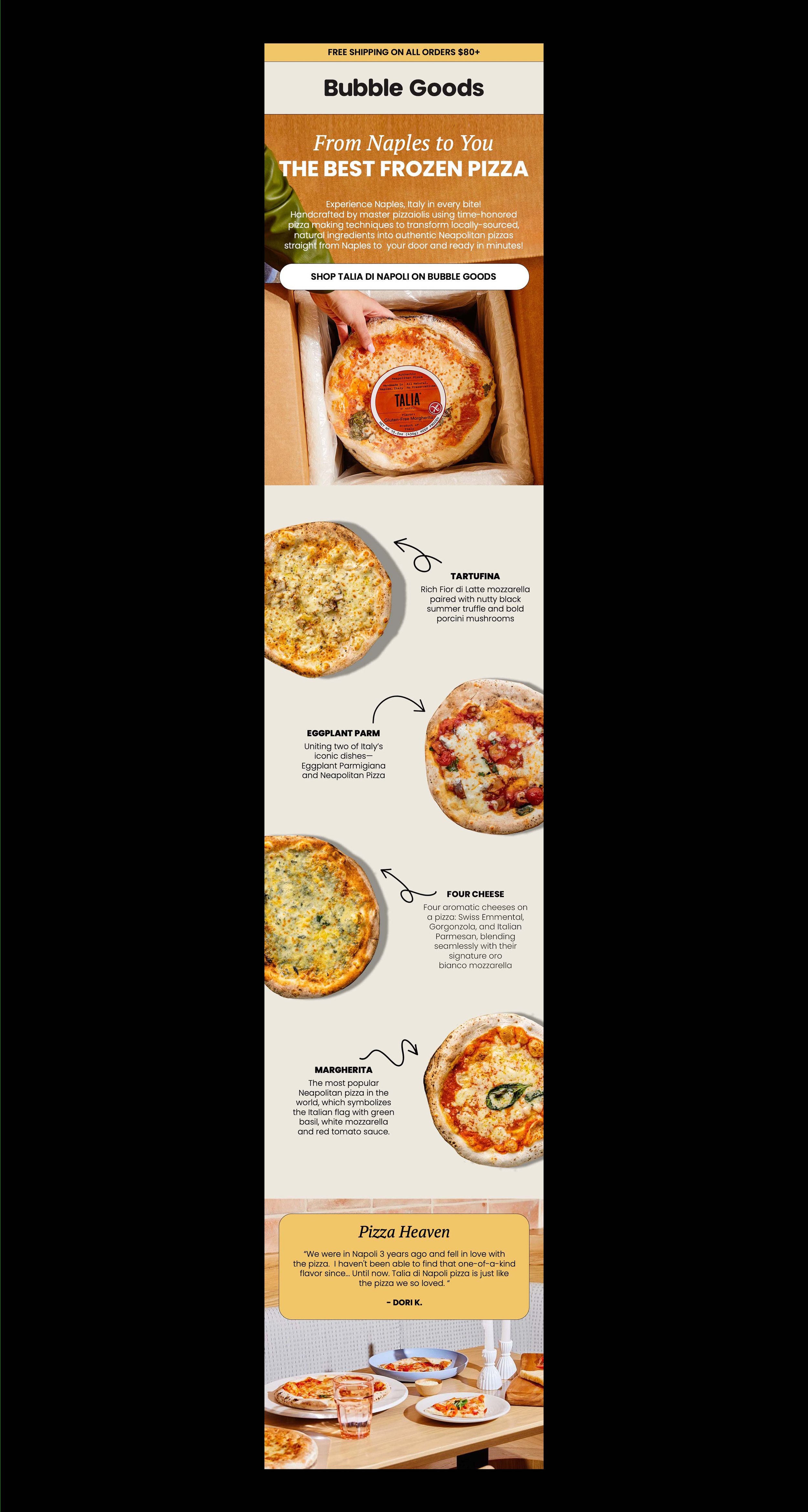
Bubble Goods, 2020 - 2024
Bubble Goods is an online marketplace that aims to support and amplify small independent health food brands. Led the brand’s visual identity growth and brand refresh.
Collaborated on marketing strategies, ad campaigns, and social media content creation that increased new user traffic. Additionally, worked with the Tech/Engineering Team on UI/UX design enhancements to increase overall website conversion.
Email Design — UI/UX — Art Direction — Photography — Videography — Content Creation — Food Styling


Content Creation for Bubble Goods, 2022 - 2023
Collaborated on marketing strategies, ad campaigns, and social media content creation that increased new user traffic.
Content Creation — Videography — Social Media

Hella for Bubble Goods, 2019
Designed the packaging for Bubble Goods’ first CPG product Hella, a vegan cacao hazelnut spread. Covered by main foods publications and sent to celebrities, Hella has sold out over six times!
Packaging Design — Art Direction — Photography — Videography — Content Creation — Food Styling

WeCycle, 2022
WeCycle is an upcoming app that highlights and encourages composting around New York City. Collaborated with team member in storyboarding and animated video content that educates the public on composting.
Content Creation — Animation
Lauren’s All Purpose, 2018
Lauren's All Purpose Salve is an organic salve moisturizer for the body. Provided art direction and shot film photography for brand to use for website and social.
Art Direction — Content Creation — Photography


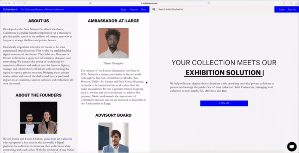
Collecteurs, 2018
Worked alongside the founders and developers to design several UI/UX pages for their re-branded website that aims to democratize art.
Website Design — UI

Renna, 2018
Renna, an eponymous jewelry line that celebrates her childhood nostalgia at the California beach. Provided art direction and shot e-commerce photography for initial brand launch used for website and social.
Art Direction — Content Creation — Photography


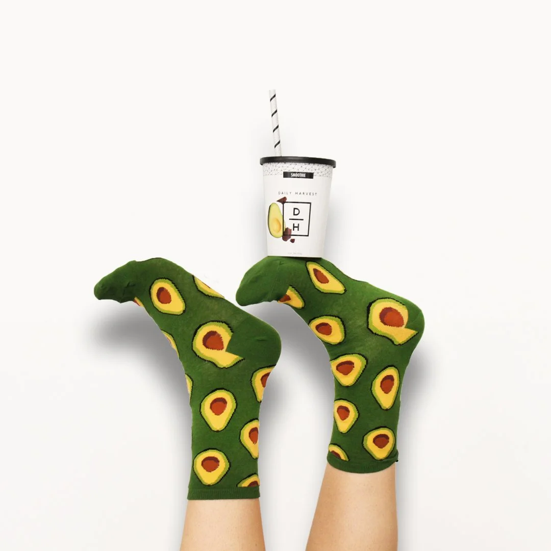
Daily Harvest, 2016 - 2018
Worked closely with the founder to help design a series of marketing emails. In charge of designing a set of emails for a smoothie challenge during the month of July 2016. Along with designing digital creative assets and other marketing collateral, was in charged of food styling and managing and creating visual content for Instagram.
Email Design — Content Creation — Food Styling — Marketing Collateral


The Where, 2018
The Where was a year long exploration on locational memory for my senior thesis. The Where is a project that uses public participation from the beginning to the end. The thesis of the project is to showcase personal memories with location for the public to interact with. We do not necessarily remember where we had our first kiss, but when asked, “Where did you have your first kiss?” the memory starts to unfold. The Where is a project that explores how memories create deep connections that intertwine place and an event, public and private space.
Website Design — Wheat Pasting


Fragment, 2018
Fragments is a screen printed artist book made up of a series of individual posters. Fragments Is inspired by the visual language of typography in the context of broken up conversations. These conversations stem are personal dialogues that touch upon many topics, such as: politics, religion, sexuality, fear, friendship, and love.
Artist Book — Book Making — Print Making — Screen printing


Dark, 2016
Dark is a publication inspired by the analogue process of developing photographic film in a darkroom. The process is never perfect or guarantee despite its precise chemical process. It’s a systematic process that ends in unexpected results. To have an end result be a surprise is the concept of the publication. Stories and articles were chosen based on their unexpectedness.
Book Making — Typesetting — Editorial Design


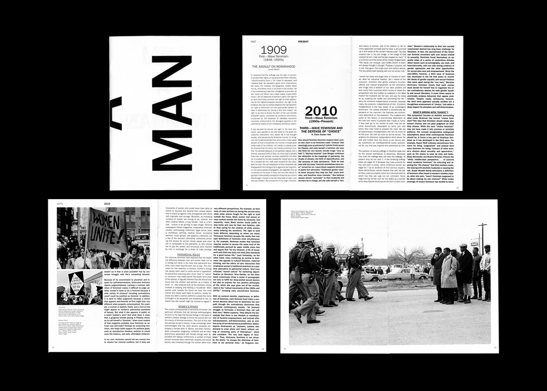
I Am Man, 2016
I am a Man is a publication is inspired by the current cycling of social movements in juxtaposition (or in parallel) with the past movements. The publication focuses on three social movements: feminism, civil rights, and LGBTQ.
The publication centers around the repetition of the past and how history is repeating itself. The parallel of texts from the past and the present shows how much society has changed (or not changed).
Book Making — Typesetting — Editorial Design


America, 2016
America is a publication inspired by the phrase “silent majority.” The publication explores the two–sides of America’s current social–political climate leading to election of the 45th president. The publication shines a light on the silent side while showing and creating a dialogue of the two sides.
Book Making — Typesetting — Editorial Design


